Project #3- Final Color Grids and Photos
Cool Colors
I wanted to toy with a picture of Audrey's eye, with her also doing my eye. When I discovered the purple hue that came from Audrey's mascara when I played with the color settings, I immediately wanted to create a piece that went with the mood of the color shown. Therefore, I modified the eye to give it peacock colors, giving the overall image a very fey-like appearance. I believe it portrays cool colors in a very lively way, contrasting the traditional moods of cool colors.
Warm Colors
In all honestly, I had no original intentions for this photo. I wanted to have fifty images, but was a bit short, so I took a picture of my lunch. However, when I began editing it, I realized how much I could do with it and how interesting it can turn out. I edited the original pale lighting to be a soft but dark orange, and blackened the rest of the scene to give the apple and the hand the spotlight. I also unintentionally gave the photo a good contrast of value where the most golden part if the apple stands out against the black environment.
Monochrome
I recently bought a set of multicolored bulbs and tested how they would look on the person using different color combinations. Out of the five colors, I found that red and blue, orange and yellow, and green by itself created the best lighting environments. This photo was the best of the ones I took, giving the whole world a beautiful green filter. It was like I was in the center of the Emerald City. I did very little to edit the image save for emphasizing the black of my coat and removing some grain.
Complementary Colors
The funny thing about this setting is that the building isn't purple and yellow, but is still set of complementary colors (blue and orange). The strength of orange didn't look right with the idea I had in mind. I wanted to give the viewer a feeling of age as they looked at the blue-green, faded trees and the muted yellow and purple building. It could leave the viewer feeling uneasy or anxious, others dulled and calm. I can honestly see it being seen in multiple ways.
Mood Image 1
This first image was taken in the auditorium's workshop to the left of the stage. Along the room's walls there are hundreds of pieces of graffiti from the drama students dating back to the 70's. I wanted to change the mood of the setting to be more menacing, so I emphasized the red and black in the scene as well as muting the yellows and blues. I also changed the greens to appear more yellow and gray.
Mood Image 2
I found the mural next to the farmers market to look very dream-like and imaginative. I really seemed to pop out from the surrounding buildings, so I emphasized that mood by desaturating and softening the background and increasing the saturation of the mural. Sometimes, dreams can take people out of the dull blur of the real world into a nonsensical wonderland, and that is what I wanted to portray with this photo.
Mood Image 3
Already, the shape and brightness of puffy clouds on a bright day can give the viewer a light, and pleasant mood. I wanted to tweak the photo so that it also causes the viewer to feel bubbly or innocent. A child watching the sunrise and believing the pink clouds to be cotton candy is the character I might want the viewer to put themself in as.
3x3 Grid
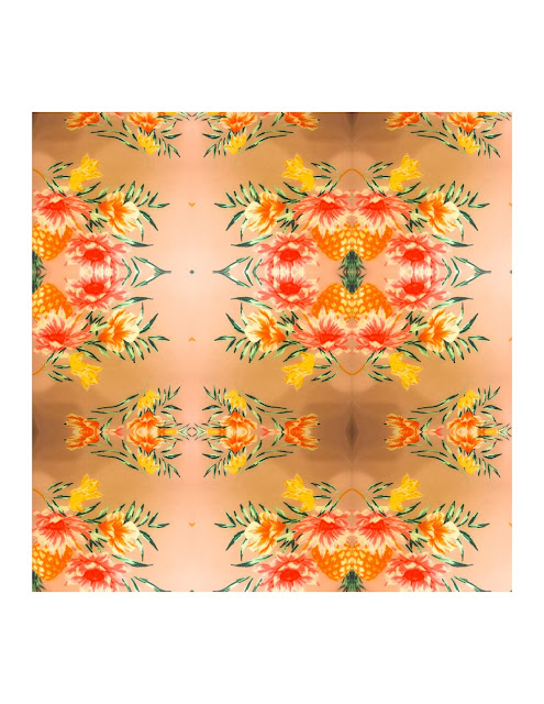
I used the warm tropical pattern on a friend's shirt to create an updated design of my own. Though it did not turn out as well as I had hoped, I attempted to make the design resemble rinds of flowers about some pineapples. Perhaps it is a dinner centerpiece.
18 Square Grid
This grid was made up of a series of shots of a person jumping put into three colors. I wanted to give the image a resemblance to heat vision, with the jumping person deliberately appearing bright and blury as to show the "heat" coming off the person.


Comments
Post a Comment